Ranking the New NFL Uniforms For the 2020 Season
This offseason has been featured by the neverending free angency saga of a little-known NFL prospect named Tom Brady, but followed close behind was the intrigue of numerous uniform redesigns.
Seven franchises decided to change up their look this offseason, and I can't remember the last time there was that many teams to switch up their looks at once.
Let's take a look at how each one went, in order of worst to best results.
Now here's a little prerequisite: Overall, I really like every team's redesign, so even the teams I have at the bottom I feel made improvements on what they had before.
There lies the problem, they are replacing one of the worst uniform sets of all time, so of course they look better. I don't remember many people praising the uniforms when they were the main set. They've always just been there. They're solid, but that's it.
Also, the pewter alternate is just... odd. The striping is inconsistent with the home and away sets. If they would have splashed even a small amount of orange on to the uniform, it would pop so much more.
6. Browns
Essentially just hit Ctrl+C then Ctrl+V to what I said for the Bucs. The previous Browns uniforms were garbage, with that hideous drop shadow and "Browns" in massive lettering in lieu of an actual pant stripe, as if we didn't know from a mile away that the NFL team with gross brown uniforms were indeed the Cleveland Browns. Having gross turd uniforms are kind of their calling card. We don't need the name down the leg to know that. The difference here is that these actually do improve ever so slightly the classic design, and it all comes down to the numbers. The new number font is classy, yet interesting. Modern, yet timeless. It just works.
One of the best things to do though when you are a team with a classic look like the Colts is not to reinvent the wheel, but to lean in on the retro feel in a classy way.
That's where these new uniforms (if you even want to call them that) factor in. They added a nice, new coat of eggshell white on to the walls, instead of deciding to paint the walls magenta.
What I'm saying is, the main noticeable things the team changed is the number font (which rocks), and tweaked the Colt logo on the helmet. That's all it needed. Nothing flashy, but it polishes the unis up so much.
The only down side is that they made the Nike swoosh black on the away set, even though black does not show up anywhere else. Which, I mean, fine I guess? It's not super ugly, just seems like a weird choice.
4. Rams
The away uniform though seems to deviate almost completely from the design set forth by the home.
No clue whatsoever what is going on with the shoulders. Why didn't they just add the horns? The numbers look far different than the home set.
It almost seems like the Rams decision makers came down to their final two uniform designs, couldn't decide between the two, so they just decided to go with both.
If hey simply made the away have the same design elements as the home, The Rams would likely be put higher on the list.
3. Patriots
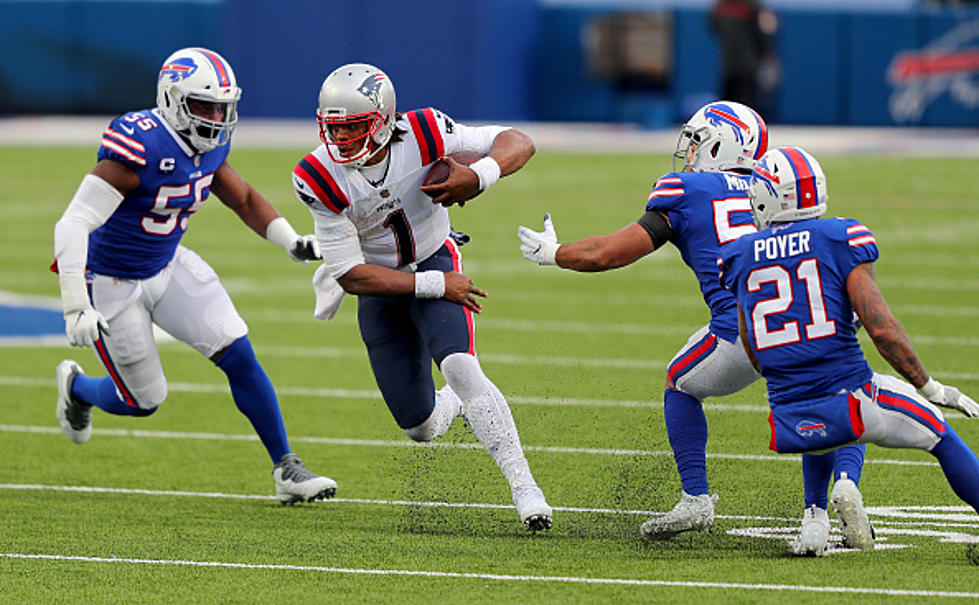
This design to mark the first time in two decades that Tom Brady is not on the Patriots roster is a great compromise between new and old.
The uniform utilizes the current numbers and color scheme, mixed with the shoulder stripes from the "Pat Patriot" uniforms from years past. My only complaint is that the colors of the shoulder stripes be reversed to match the numbers better, but overall, it's a pretty solid set.
I saw a lot of people lamenting that the Patriots did not decide to re-hash the "Pat Patriot" uniforms, but honestly, I'm just sick of teams going back to old uniforms. Move forward, not backward. Evolve your brand.
2. Falcons
The biggest problem people have (judging from the internet experts) is the red-to-black gradient uniform, and because they hate that uniform, they therefore hate the whole set. Honestly, even if you don't love the normal home and away though, they are not that bad.
While I'm not crazy about the gradient uniforms, I don't hate them, and at least the Falcons did not just go back to a retro design (which has been kept as the alternate uniforms). They are trying to push the brand forward.
As for the home and away uniforms, I think they have a nice swagger to them. The teams' colors always work, they are balanced correctly, and I love the number font. It's relatively minimalistic, but not boring.
My only gripes are the drop shadow and the chest mark. The drop shadow is completely horizontal and and thus doesn't really give any depth to the numbers, which kind of defeats the purpose of the drop shadow.
The giant "ATL" on the chest seems real clunky to me, but who knows, it may grow on me.
Over all, I'm going against the grain and saying that I love this redesign.
1. Chargers
Seriously, they have consistently been one of the best dressed franchises in the league for decades, and now, they're uniforms are even better.
Holy crap, I love these uniforms. I honestly wouldn't mind leaving my reasoning right there.
This is everything a modern NFL uniform should be.
The helmet: Awesome and now even better because helmet numbers are back. the bolt is still perfect on helmets.
The uni: Bolts as shoulder stripes are tough. The number font is a banger. POWDER BLUE HOME UNIFORMS. Even the gimmicky Color Rush uniforms are among the best in the league now.
The pants: The Chargers were meant to be in yellow pants, full stop.
It's all so minimalist, but having the bolt as a design element makes even light usage so much more interesting. They also know how to not overdo it.
Literally the only gripe I have is the powder blue helmet numbers are a little tough to see. That's it. That's my entire list of complaints.
If you're going to do a design overhaul, that's how you do it.
Best Uniforms In Each NFL Team's History
More From 98.1 The Hawk


